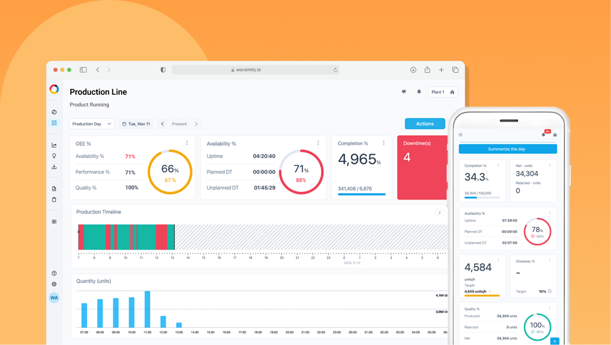
The MANDATE & CONTEXT
Worximity, B2B SaaS, provides real-time production monitoring tools for manufacturers.
The platform was widely used, but as it scaled, it became increasingly difficult for users to extract meaningful insights and act efficiently.
My Role: As Product Designer, I led the project end-to-end—from user research, insight synthesis to UX/UI redesign, discovery workshops, prototyping, and development handoff. I also led stakeholder presentations and the post-launch strategy to drive the new platform awareness and adoption.
The Users tasks and goals
Operators
Speed → Quantity → Downtime → Immediate action
Speed → Quantity → Downtime → Immediate action
Supervisors
Performance → Trends → Issues → Accountability
Performance → Trends → Issues → Accountability
Directors
OEE → Production performance → Cross-line comparison → Business decisions
OEE → Production performance → Cross-line comparison → Business decisions
Research and Discovery
Continuous Discovery & Prioritization
Thanks to our Continuous Discovery approach, we already had a strong foundation of documented user pain points, opportunities, and product feedback gathered through ongoing research and support tickets. Using the Opportunity Solution Tree, we organized these insights around user outcomes and prioritized the opportunities with the highest potential impact.
Continuous Discovery is an ongoing practice of regularly engaging with users to identify needs, test assumptions, and continuously inform product decisions.
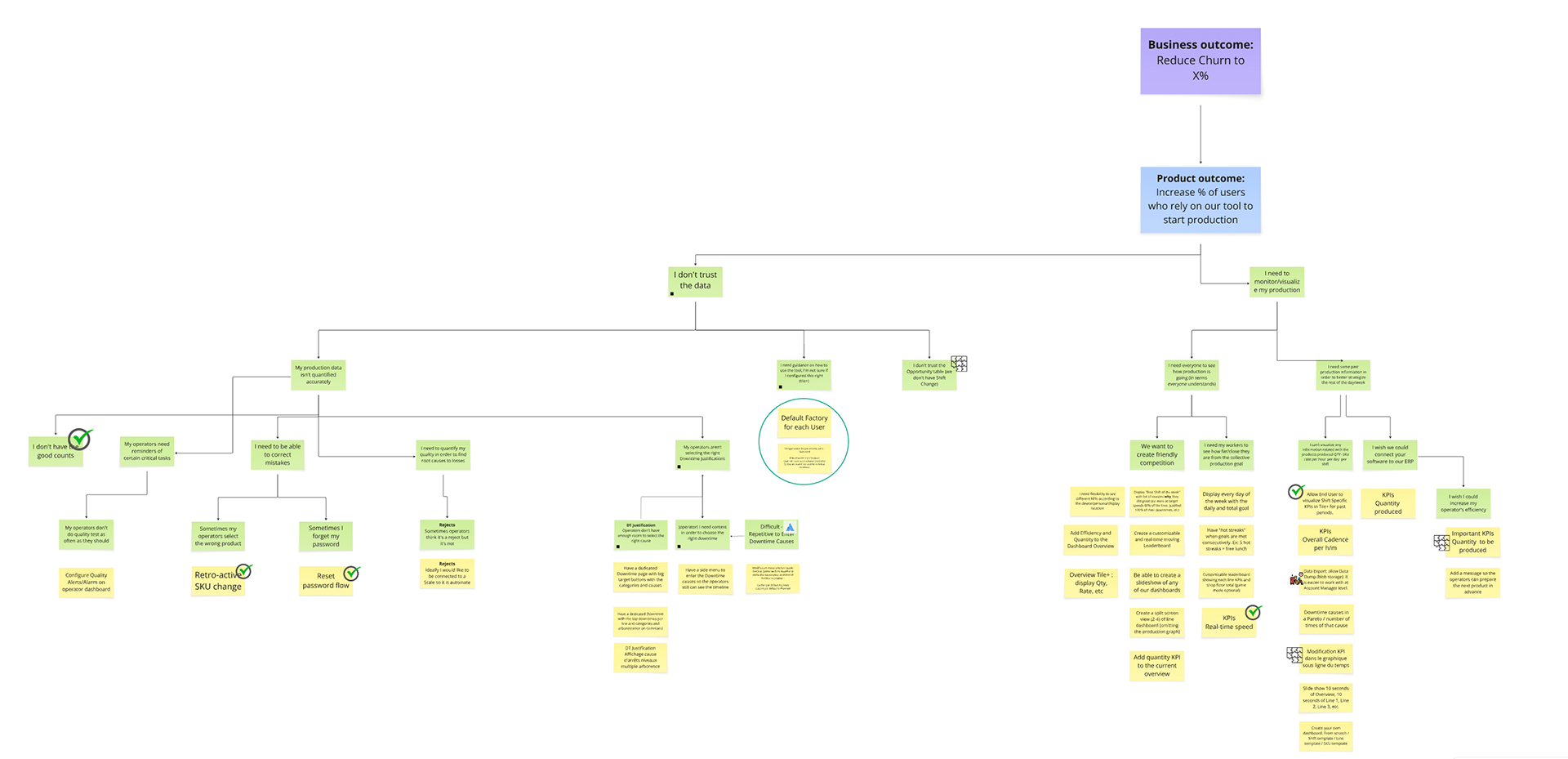
We needed to move from monitoring to continuous improvement enablement.
USER INTERVIEWS
Users were telling us:
“I can’t focus on the KPIs that matter to me.”
“Follow-up actions are hard to follow, I need all my team on the same page”
“Every line is different. One dashboard doesn’t fit all.”
“I need to see the whole story to see where are our bottlenecks.”
Problem Definition
PROBLEMS
- Rigid structure with fixed layouts and limited KPIs (max 5)
- Minimal personalization and little adaptability to user needs
- Data dashboards with no clear actions or next steps
- One-size-fits-all experience:
Shop-floor → needed speed & quantity metrics
Directors → more OEE oriented KPIs & deeper insights
- Fragmented workflows due to disconnected features and poor module integration
- Reliance on add-on apps to complete the user journey
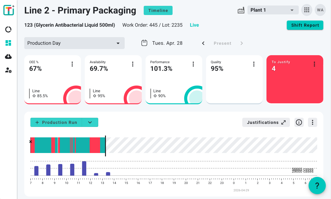
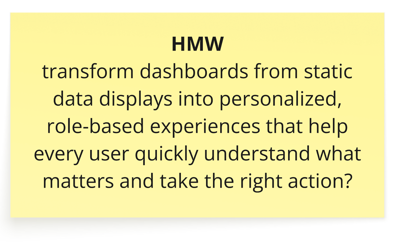
How should users personalize their dashboard?
How should complex manufacturing KPIs be visualized?
How do we connect analytics to action?
Solution
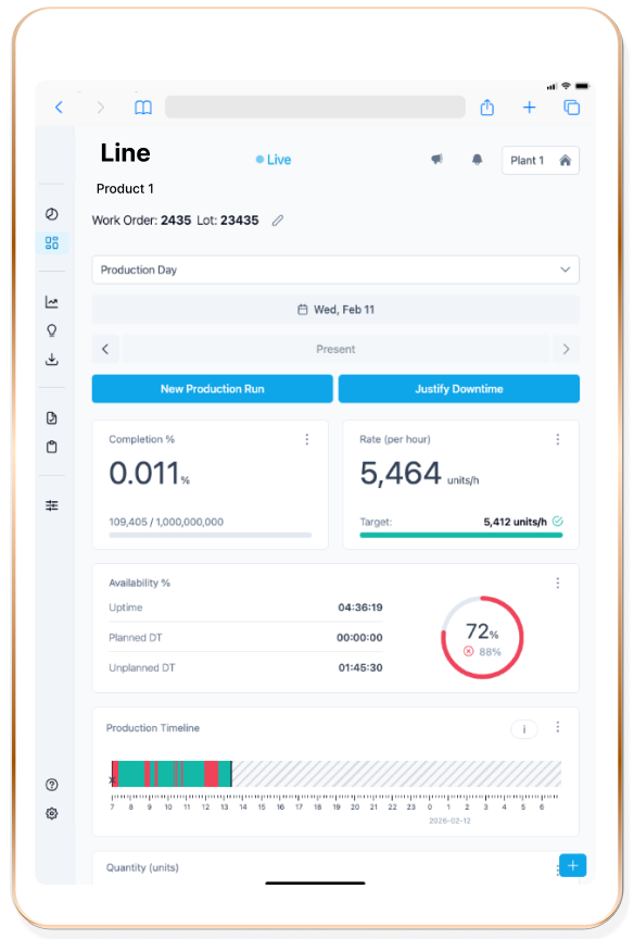
A Fully Customizable Experience
- Integrated Flow to support our different users in their different parts of their consumer journey
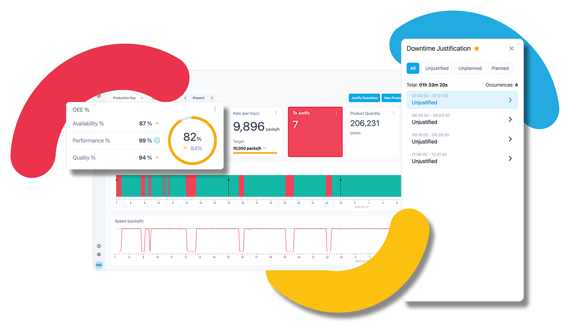
- Dashboard customization, add unlimited tiles or graphs, resize and reposition layouts.
- Clear machine status indicators, detailed OEE, Quality, and Availability breakdowns
- Integrated Task Actions Follow-up
The redesign moved the experience from “monitoring data” toward “understanding what requires attention.”
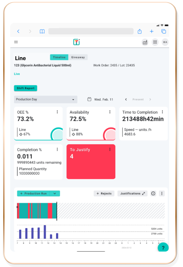
BEFORE
- 5 KPI maximum
- Fixed layout
- Limited hierarchy
- No personalization
- Data requires interpretation
AFTER
- Configurable KPIs
- Customizable layout
- Clear visual hierarchy
- Role-relevant information
- Straight forward actionable data
IMPACT
USER IMPACT
- Faster access to relevant information
- Increased clarity across different roles
- Reduced friction in daily operations
-Improved alignment between product structure and real workflows
BUSINESS IMPACT
- Improved user satisfaction (NPS) and churn reduction.
- Created a scalable foundation for future features
- +50% Product Adoption
- Increase Revenue through new features only available in the new version.
- Strengthened value proposition for enterprise clients