the Challenge
To design a new website - app - for a start-up airline, creating an online experience that is fast, easy and intuitive: one that’s based on a deep understanding of their target users.
Focusing specifically on the flight booking process: how users search for and buy flights online, their pain points and how to solve them so they have a great user experience.
Focusing specifically on the flight booking process: how users search for and buy flights online, their pain points and how to solve them so they have a great user experience.
the Process
RESEARCH
Competitive Benchmark
Task: Review four airlines websites to gain some insights on how best to design our client’s website. In order to learn how best-in-class websites solve the problems, we are trying to solve. Understand the conventions we should follow. Highlight best practices that we should emulate and which mistakes we should avoid.
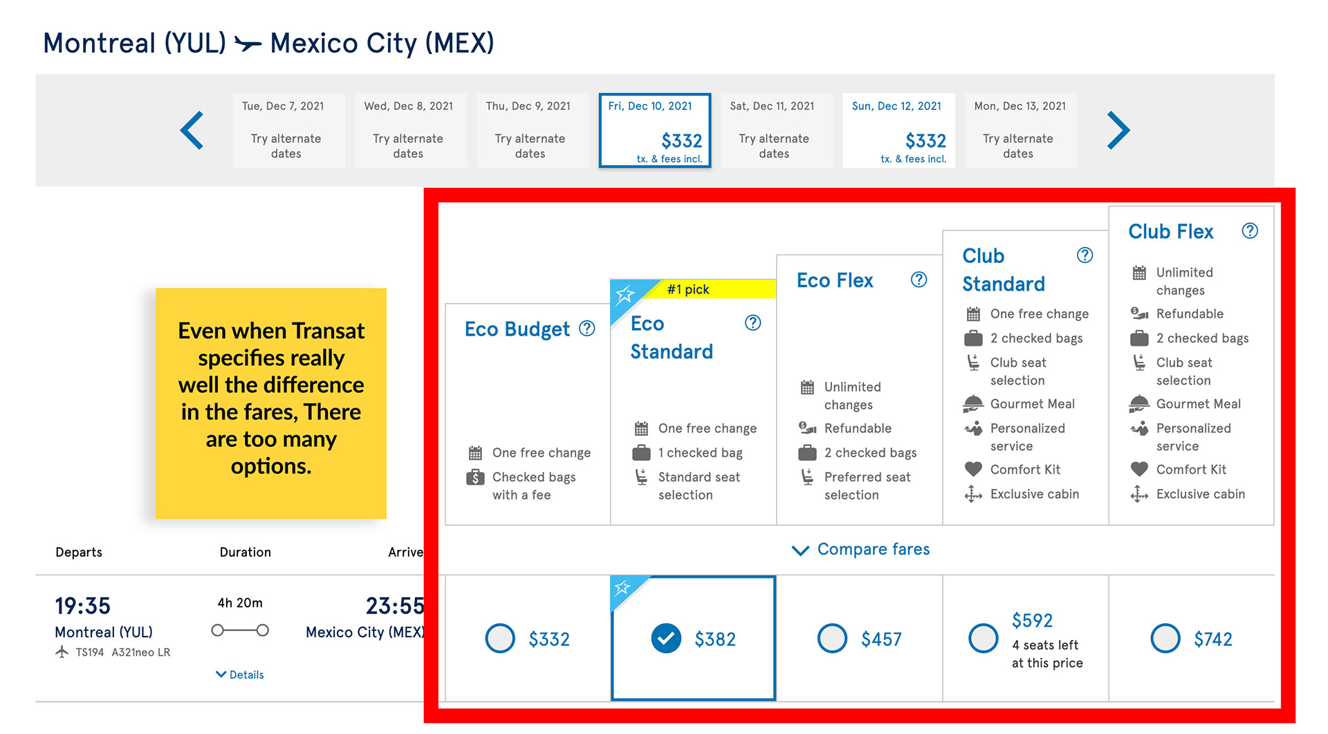
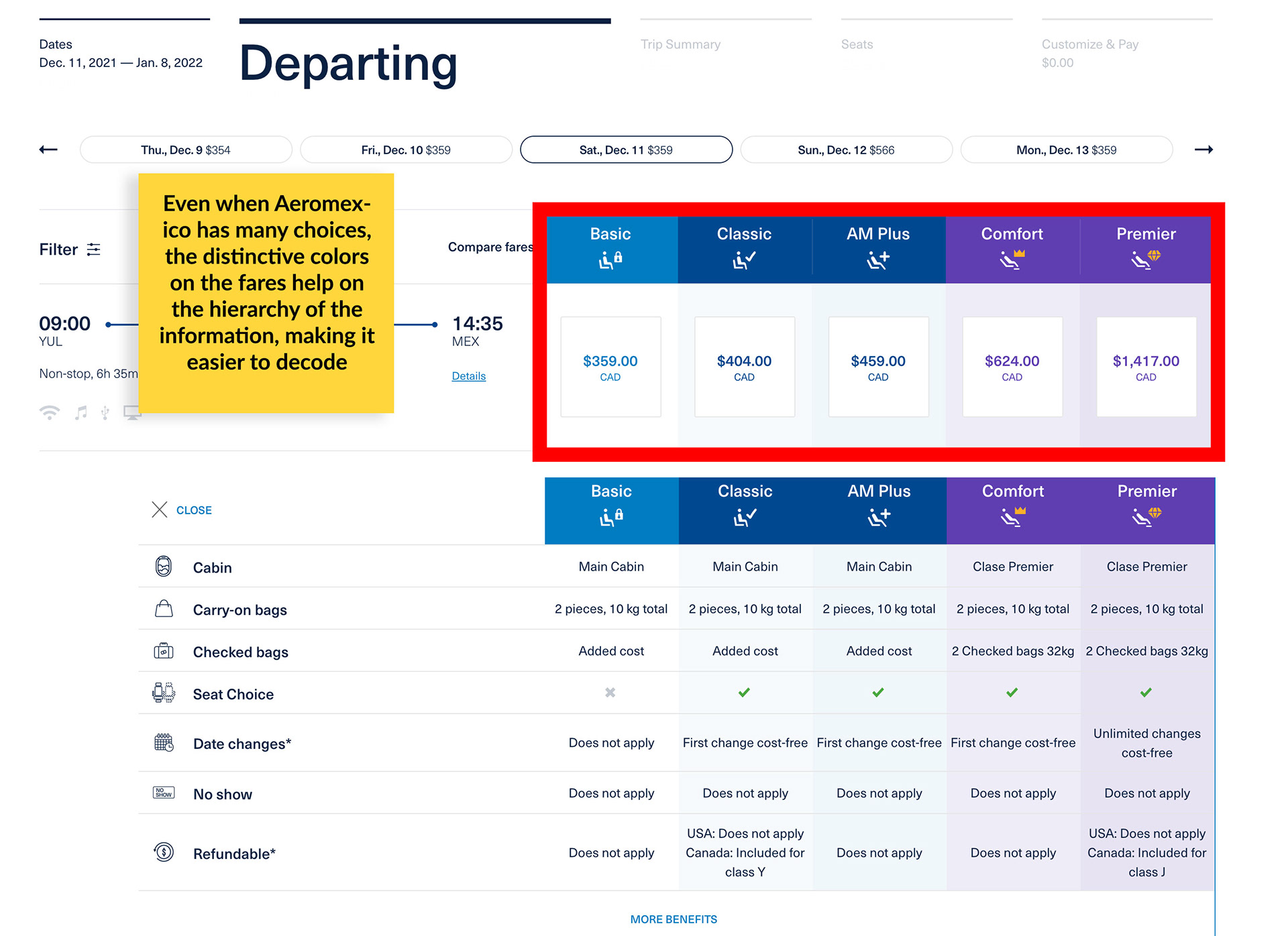
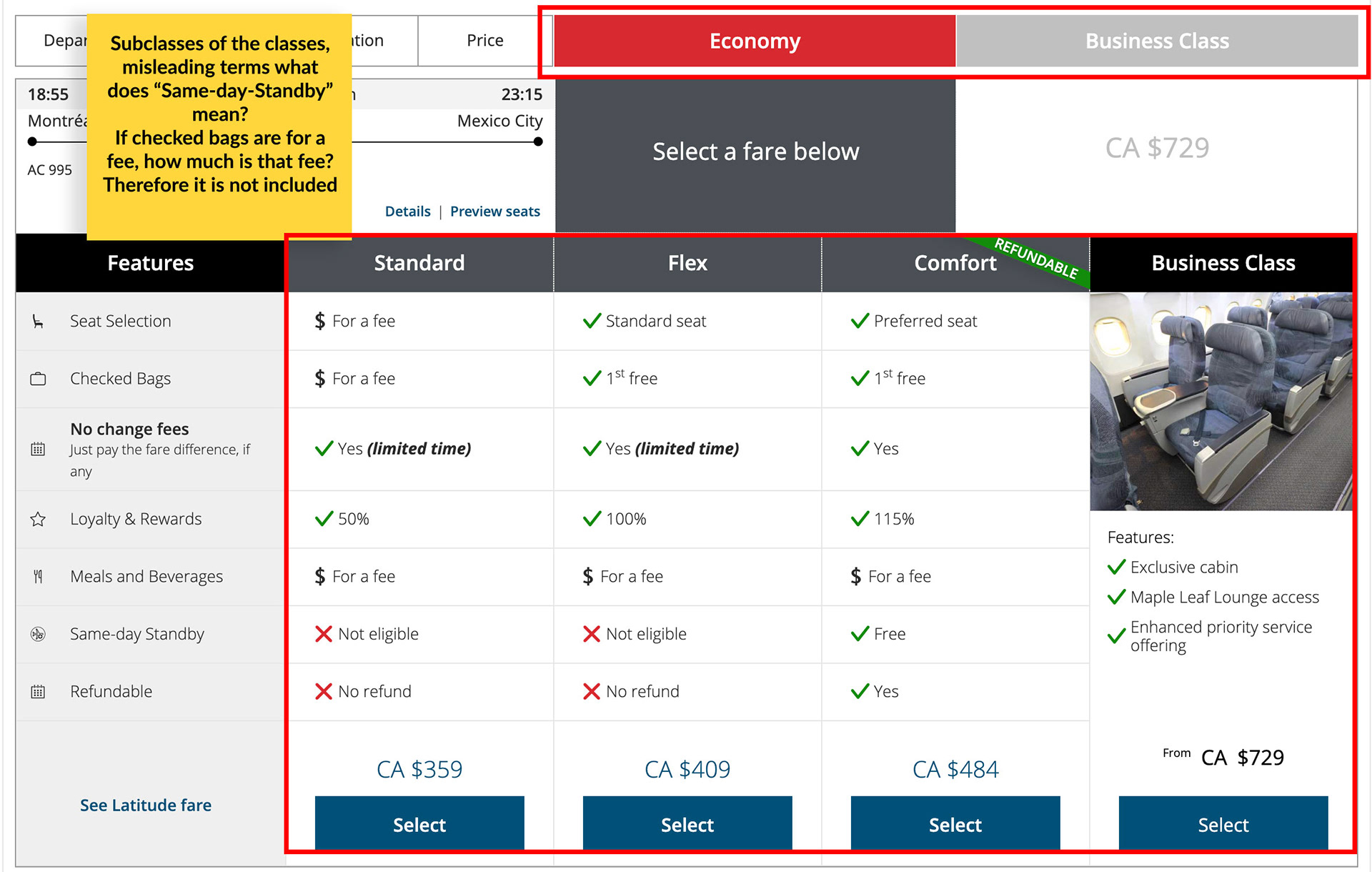
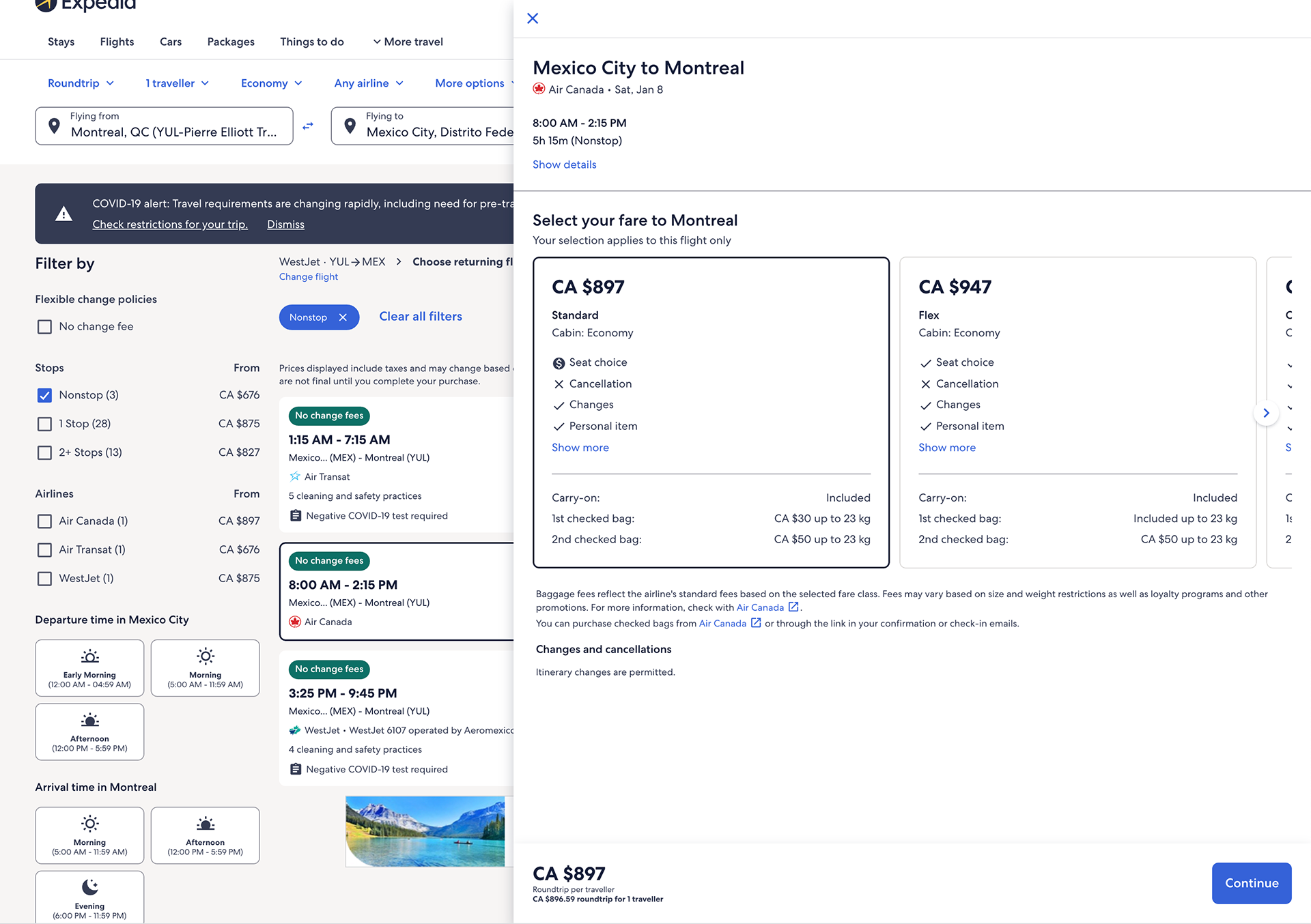
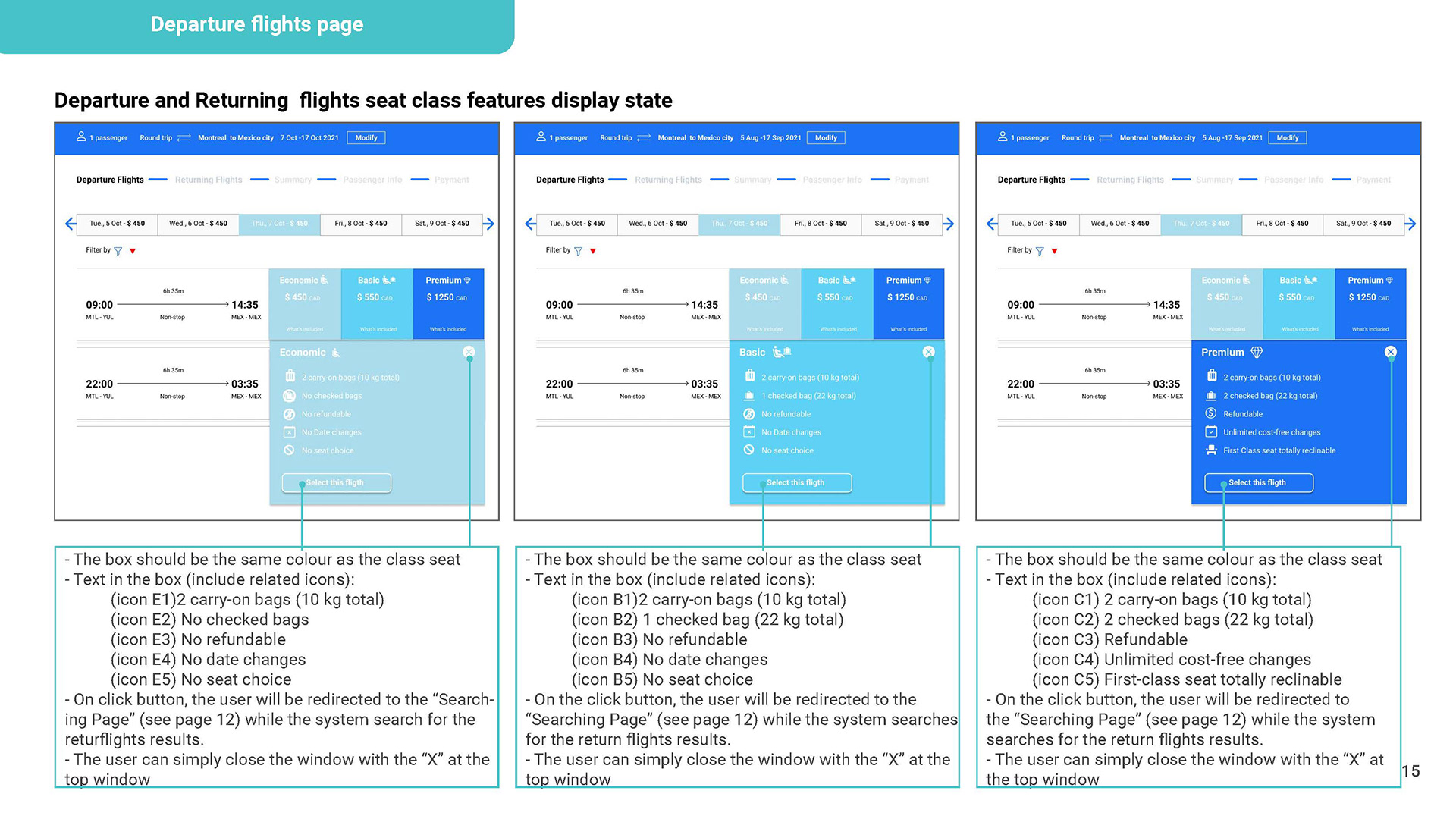
Overall all airlines have the same booking process. Some have better user experience than others but there is one big failure in all of them: Misleading description of “class seat fares”. Each airline has its own way to call the different fares, each airline has different features, some have sub-classes in the classes. And almost every airline it is not clear what is included in the price, It's almost like a "trap", especially on the baggage side. You can consult the whole competitive benchmark study here.
Note Taking
Task: Take notes highlighting the key insights from the two usability test examples, writing anything which will help to make decisions about the design later on.
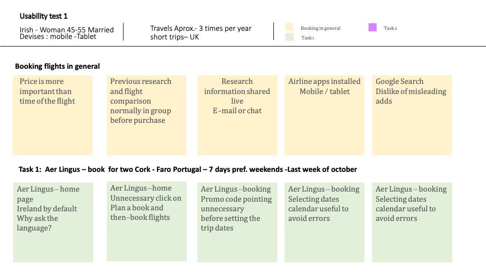
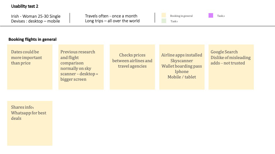
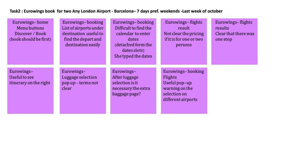
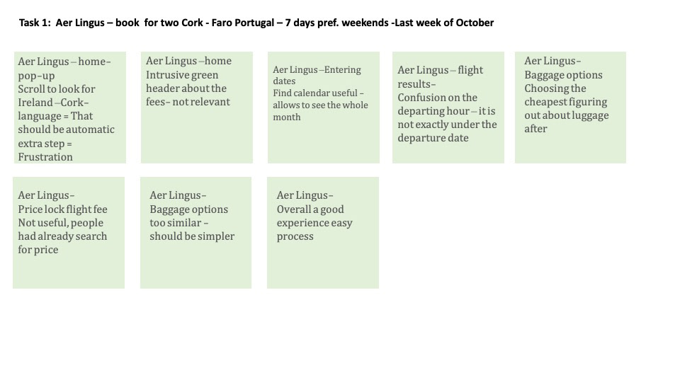
Usability test
Covid made it a bit difficult to find users to conduct a live Usability test, thankfully zoom helped a lot to conduct one. By adapting the UX design Institute sample of depth interview and usability test scripts to the particular project, I conducted my live distance test through Zoom. Here is a fragment of the test.
Analysis
Affinity Diagram
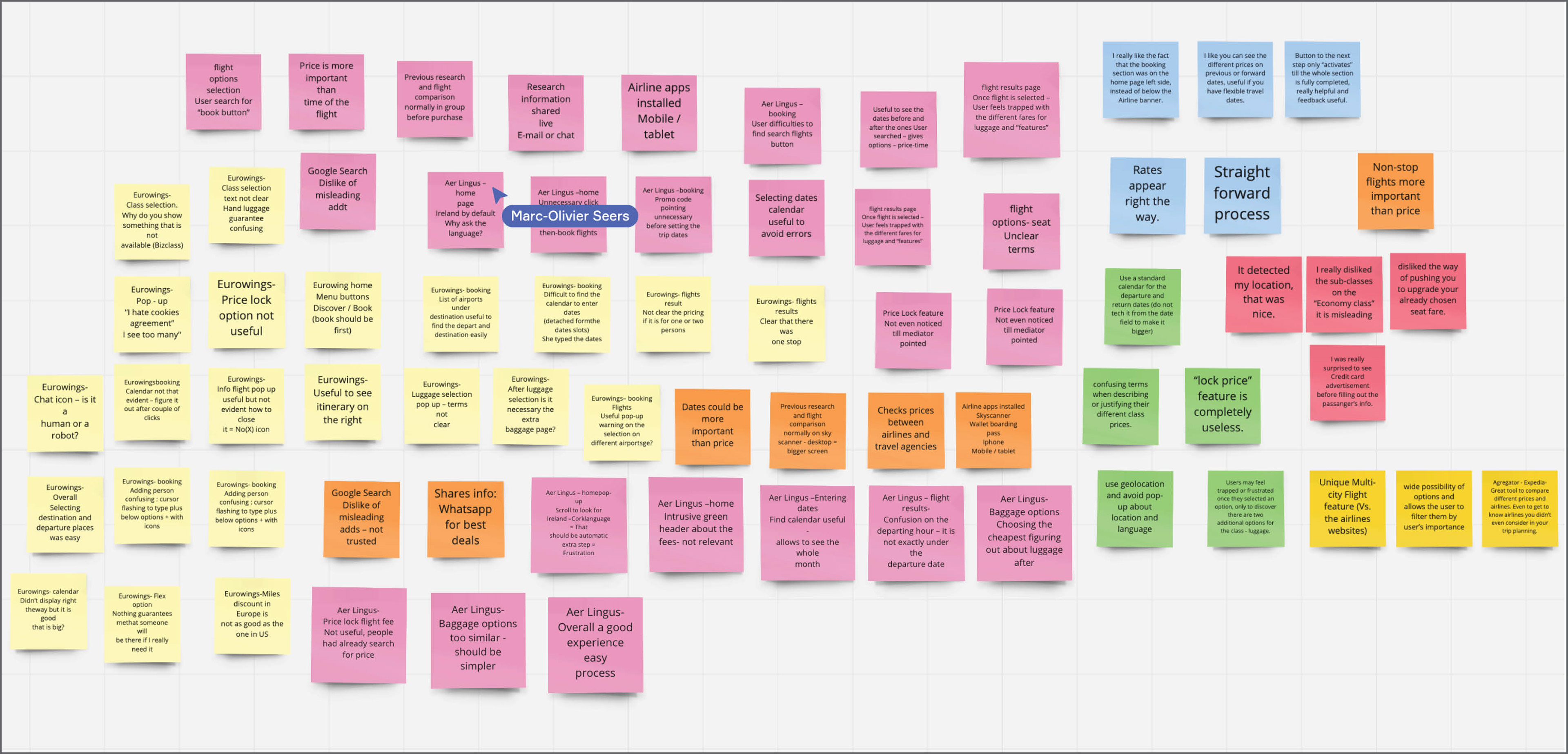
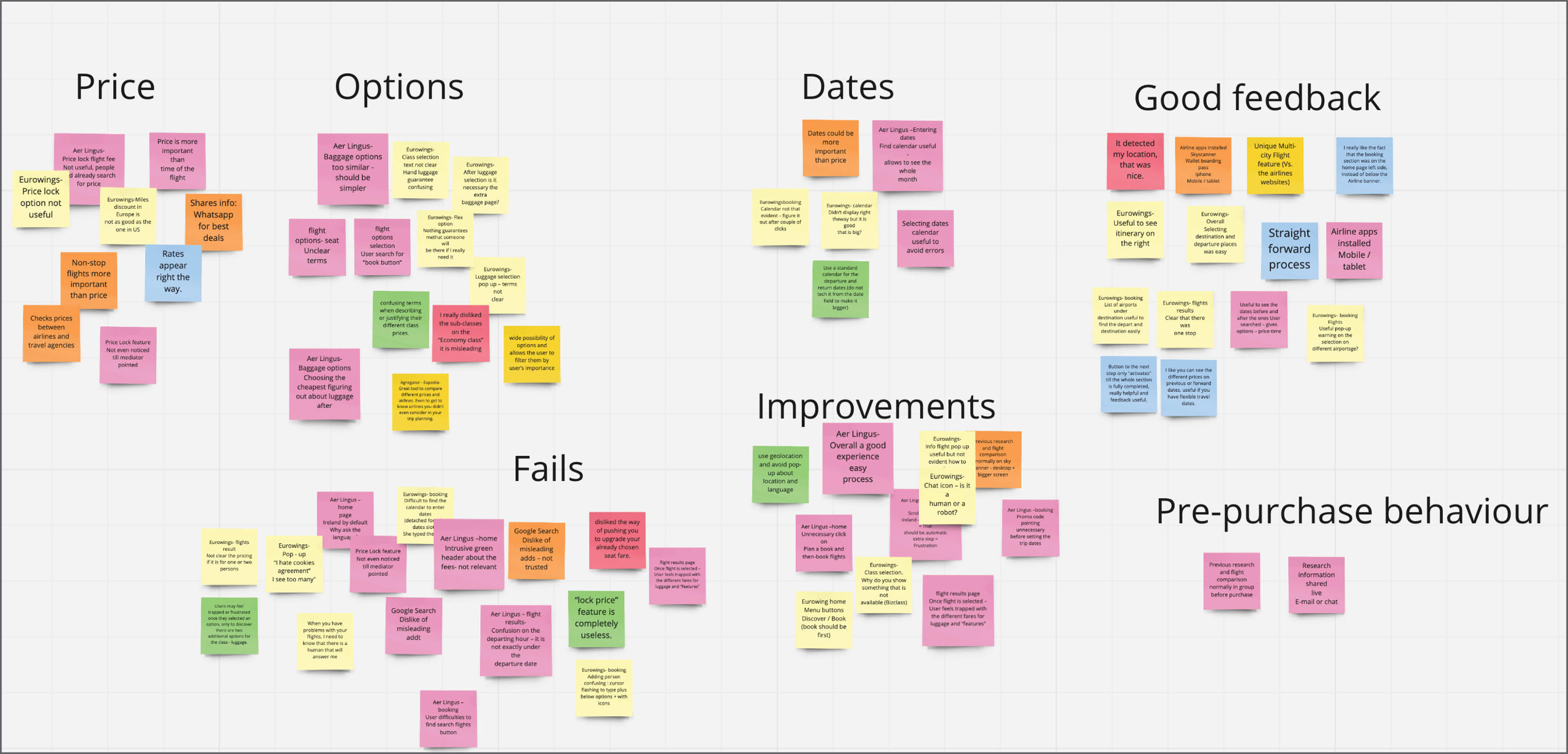
And then what do you do with all the data that you have got on the Research Process? Well, you have to organize and analyze it, using an Affinity diagram, which is a way to organize data in collaboration with a team, sharing all your previous research and then letting each member of the team write down on post-its, relevant and concise notes (one per post-it).
Once that is done each member paste their notes on a whiteboard. I used the tool, Miro for this project instead of a physical whiteboard.
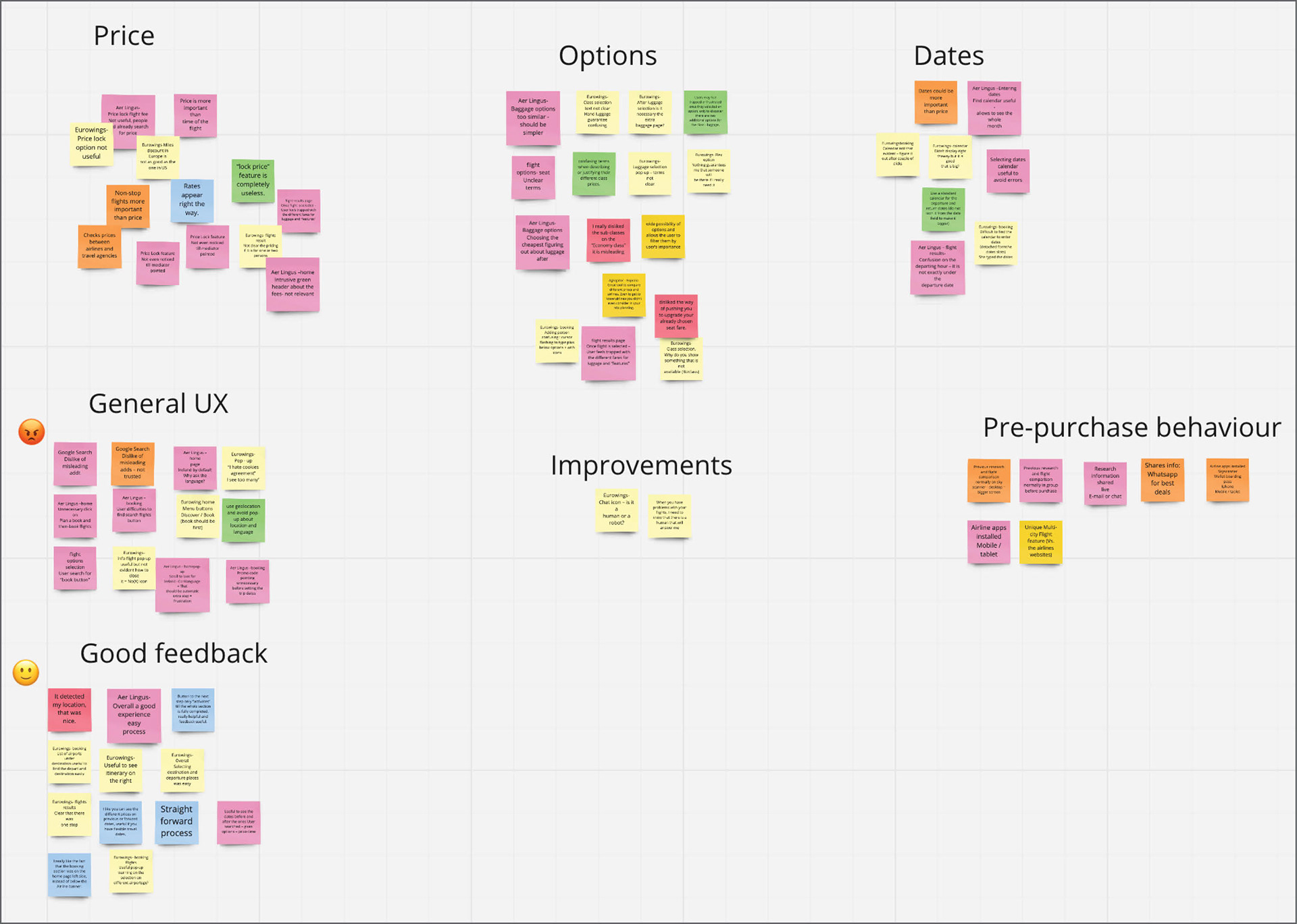
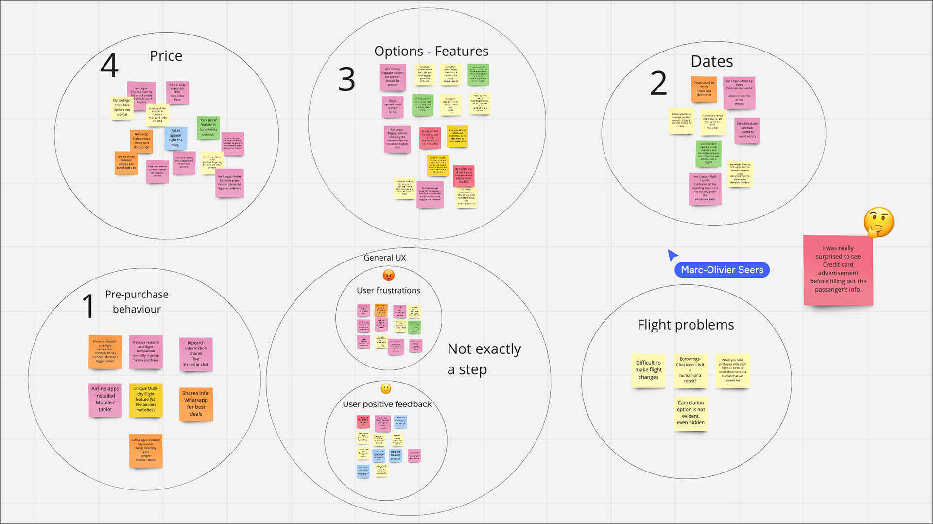
We decided that some of the groups were too broad and didn’t mean or fit any specific step, so we re-name some of the groups. We made a “navigation / General UX” group with positive feedback and failures.
Ex.: “I never click on google ads. I don’t trust them” - user comment when she first googled the airline website. It is not a related per se booking We also place emotions in the notes.
Finally, we gave numbers to each group to place them on the chronological step-by-step flight booking process. There was just one note that we didn’t know where to fit it or what exactly to do with it.
Customer journey map
Another way to translate research data into a structured document is with a Customer Journey Map, we can clearly visualize the flight booking process steps, user goals, behaviours, pain points and emotions giving a great overview of all the research data in one single document.
Design
Flow diagram
I needed to define a high-level flow for the desktop website and sketch it. Focusing on a single flow (the booking process), one primary use case. Each screen or state is represented by a box. Each interaction, such as choosing a date, should be represented by a circle. As with every sketch, it began with a piece of paper and a pencil, and here the result once it was finished.
Interaction design
The next steps in the design process were:
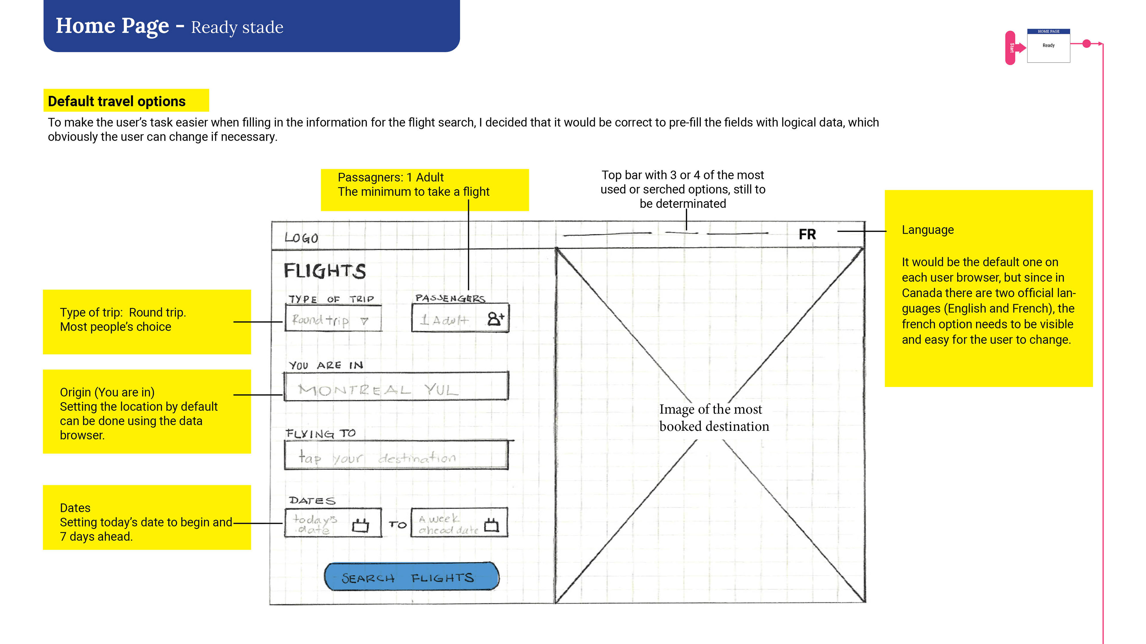
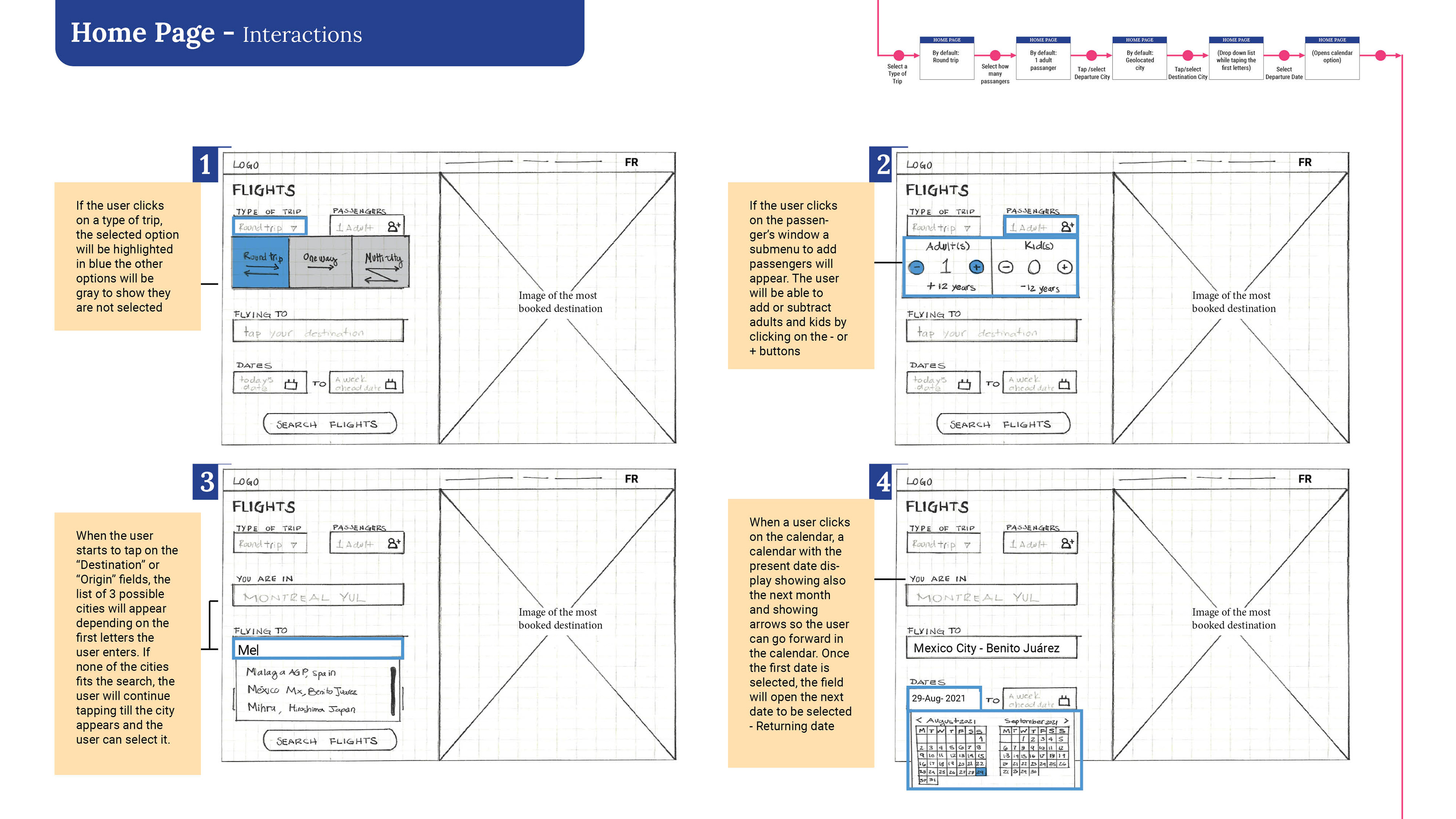
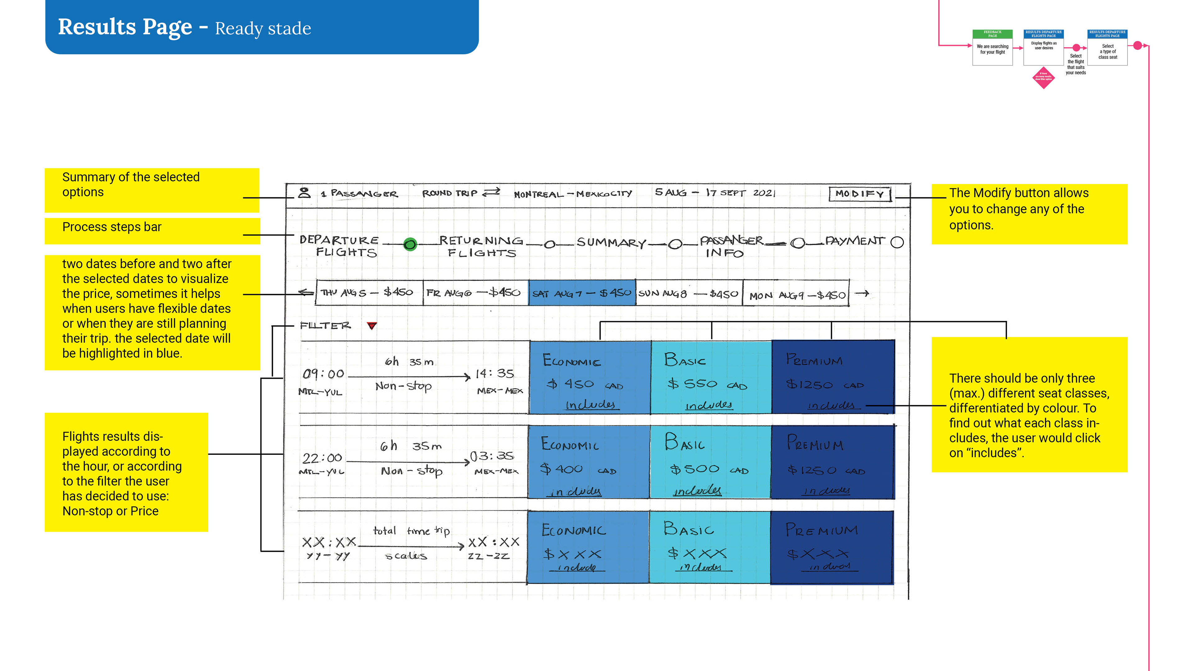
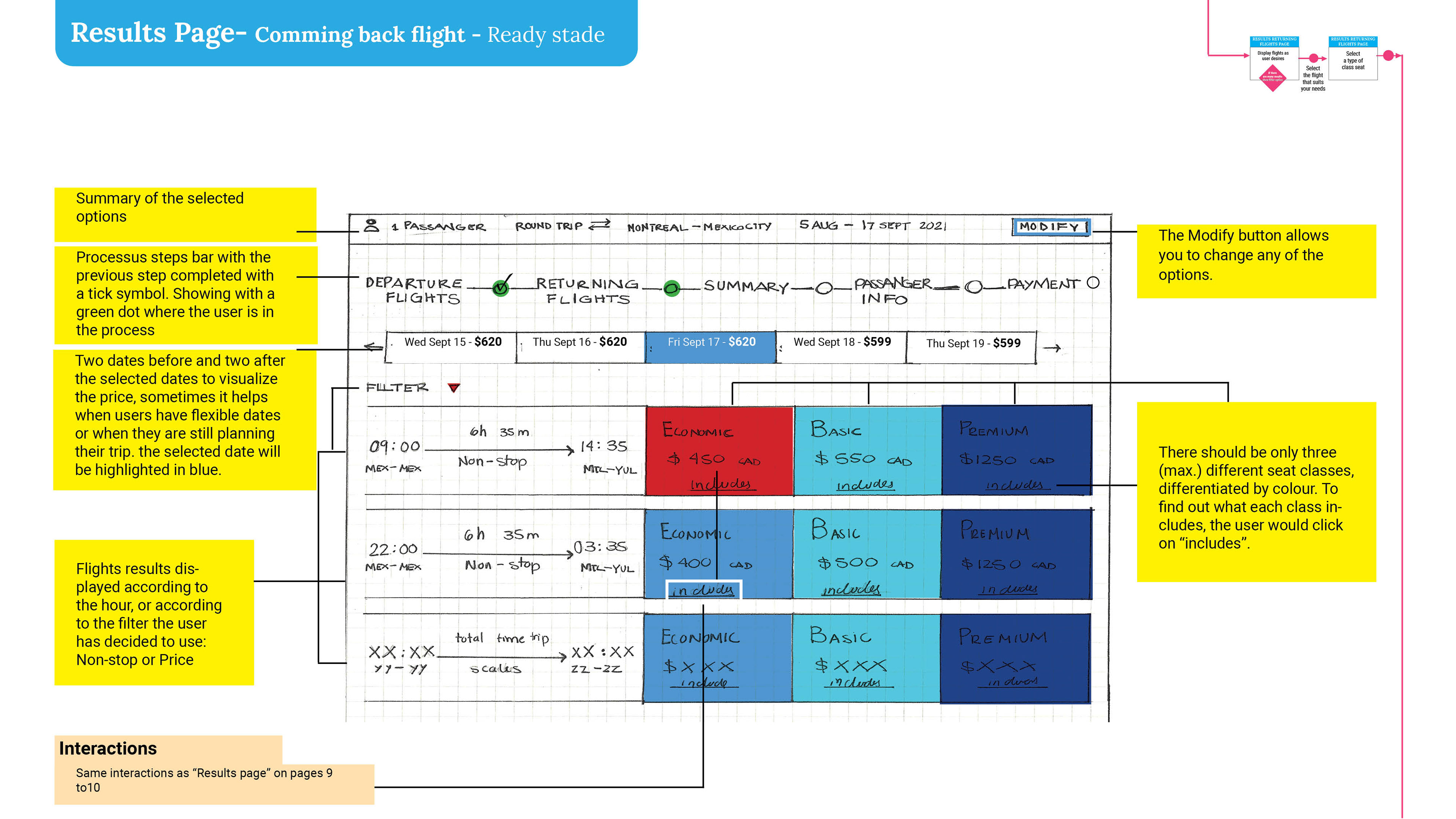
Create a list of screens to design based on the flow diagram.
I made sure to include screen states when the state differs significantly based on users’ actions.
To sketch each screen until the flow is completed. Make note of any issues or inconsistencies that become apparent: and I tackle these in the next iteration.
Of course, I didn’t get it the first time, so I had to tweak the screens several times, I even had to review and tweak the Flow diagram, since there were things that were not matching.
I Kept iterating until I was happy with how the flow worked.
Prototype
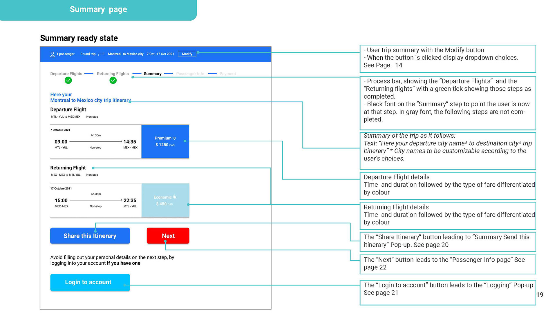
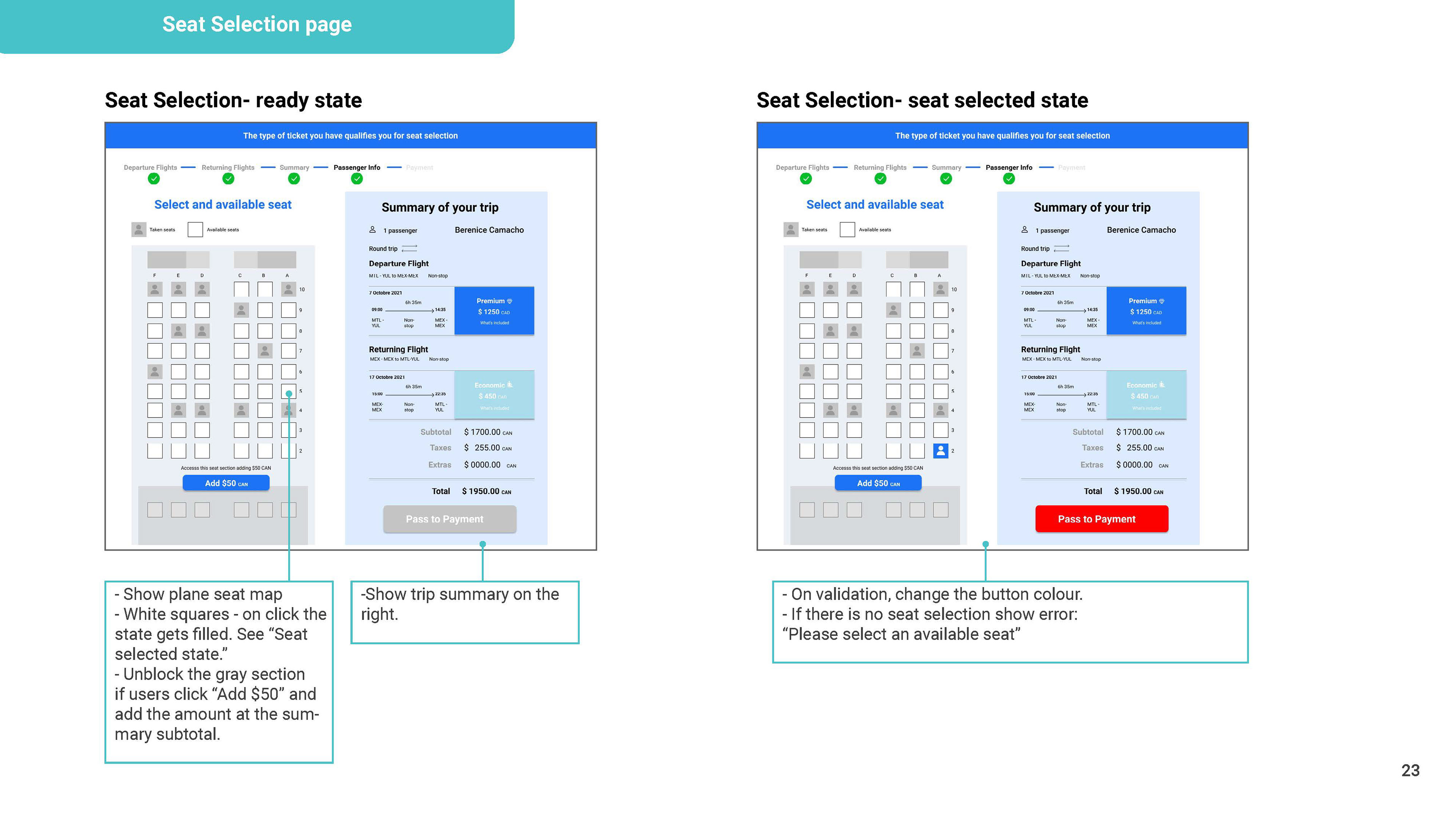
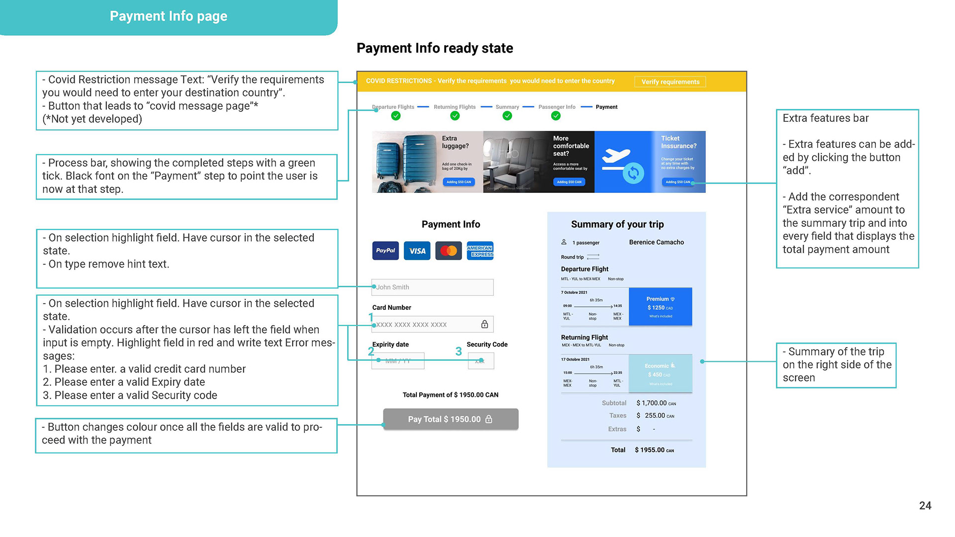
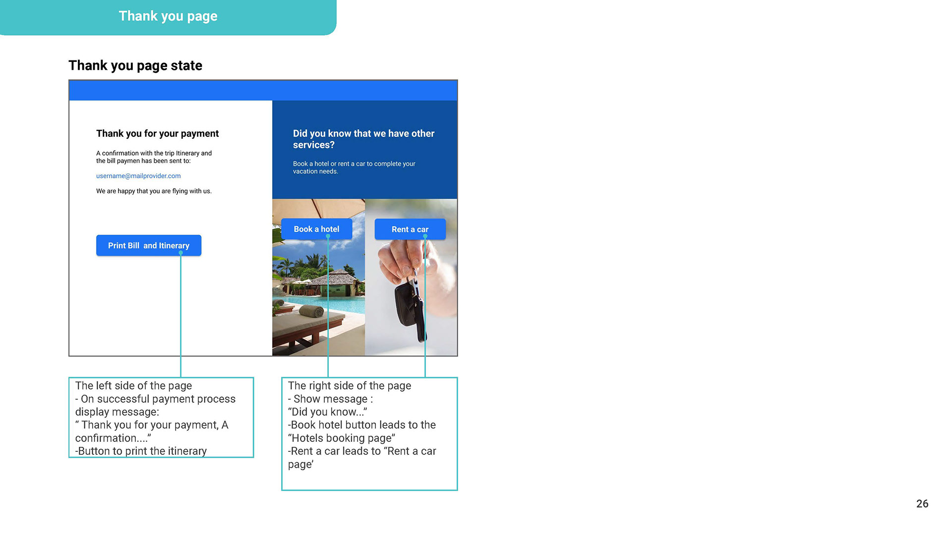
WIREFRAME
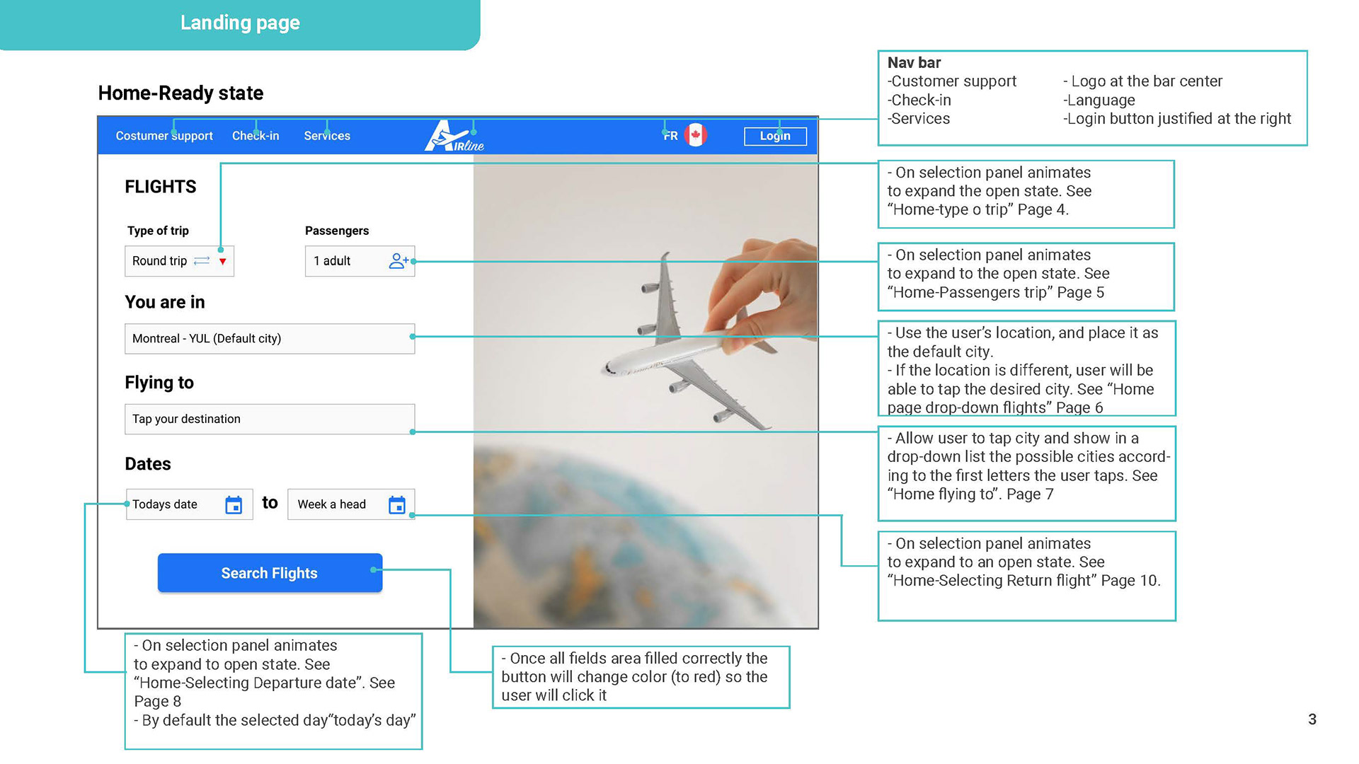
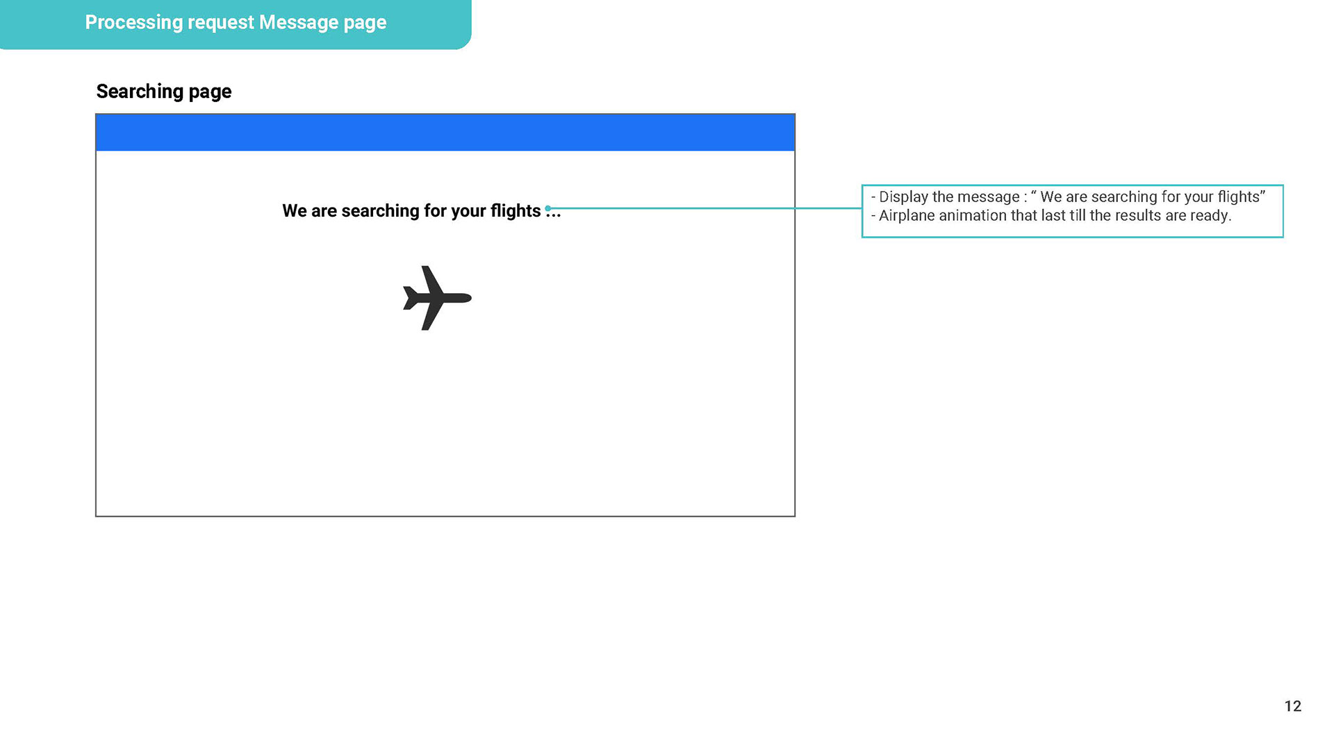
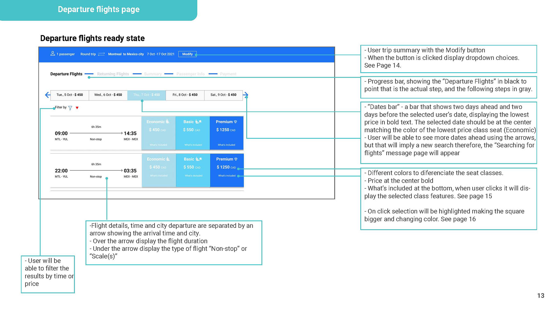
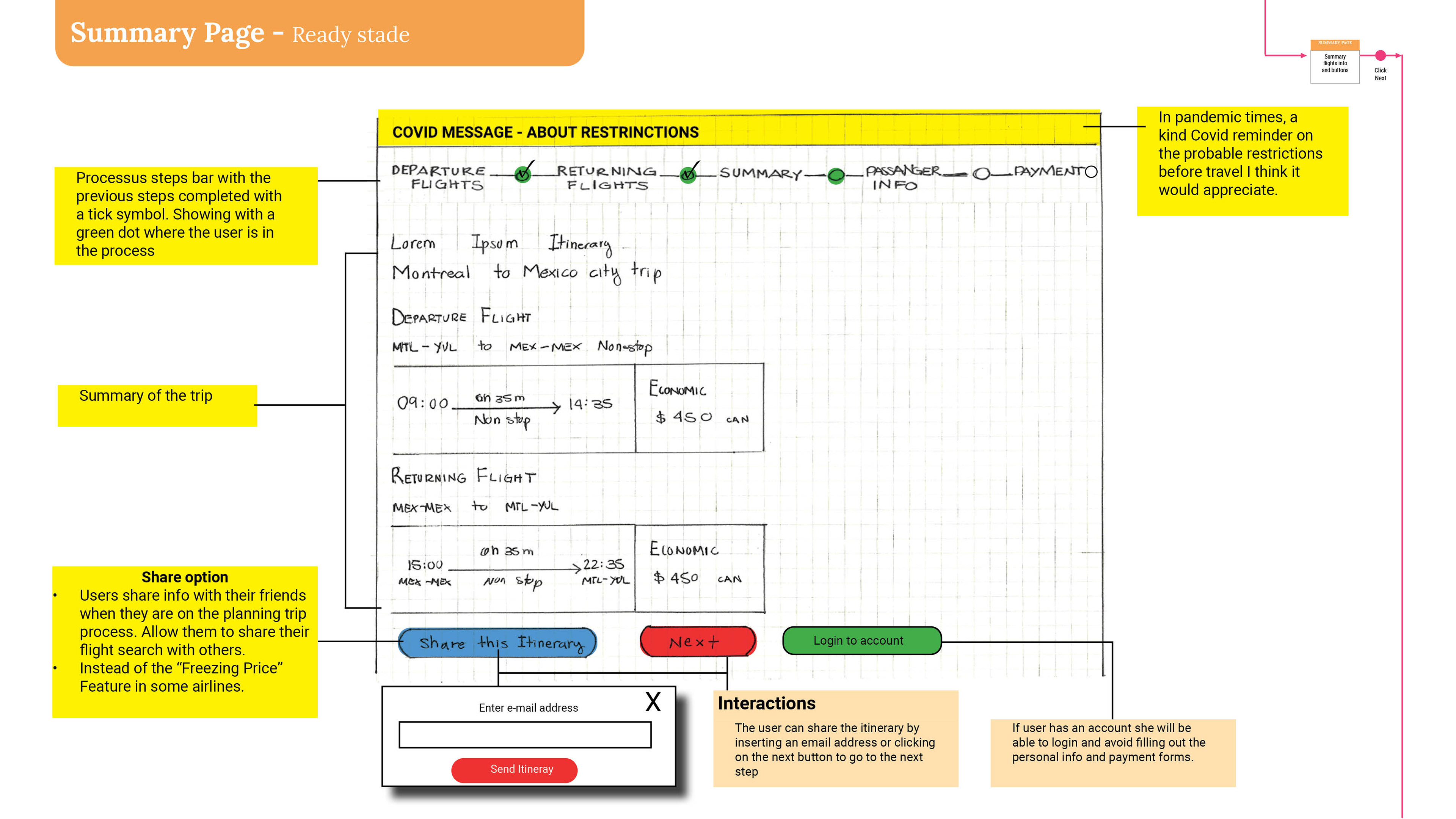
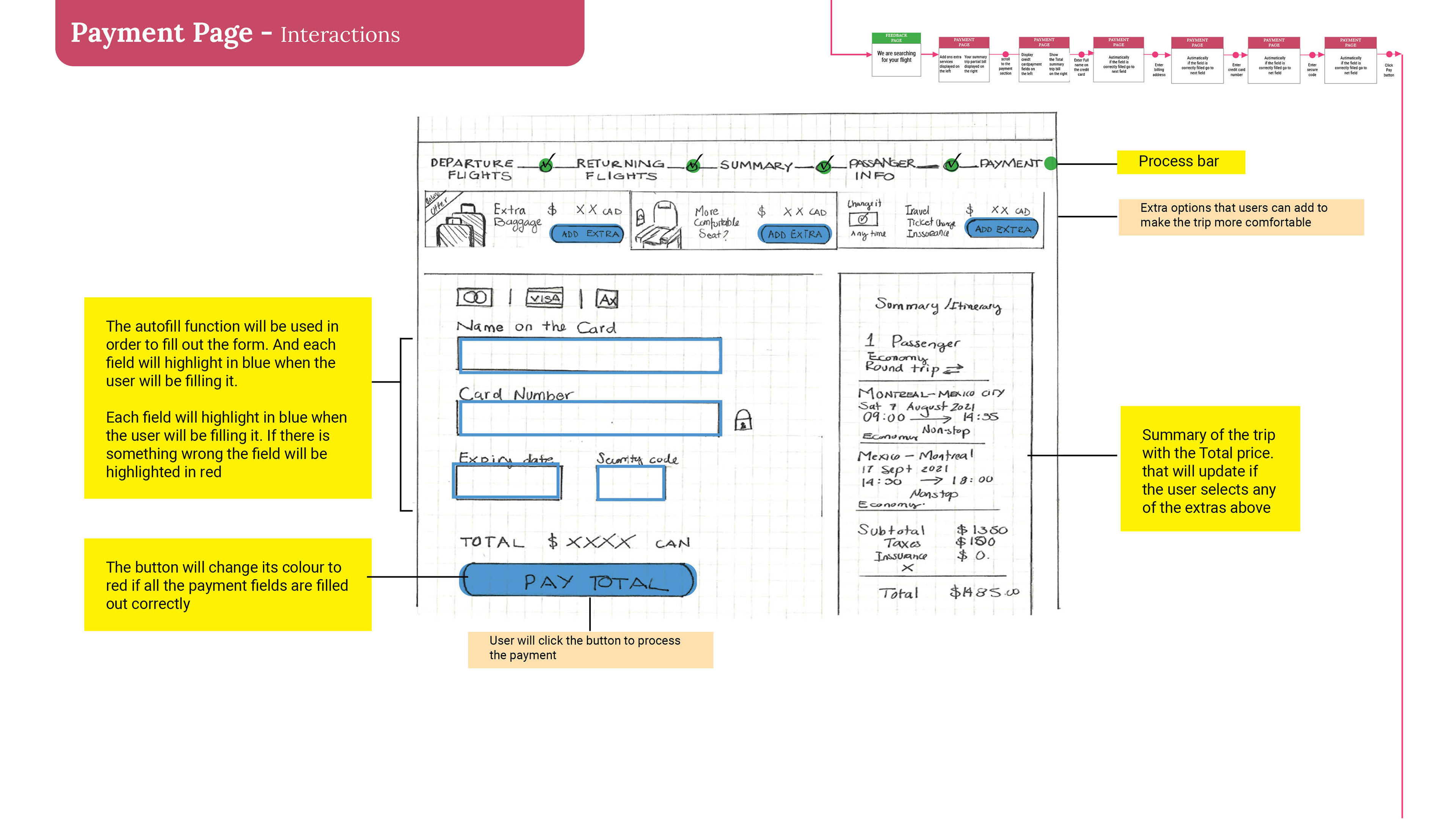
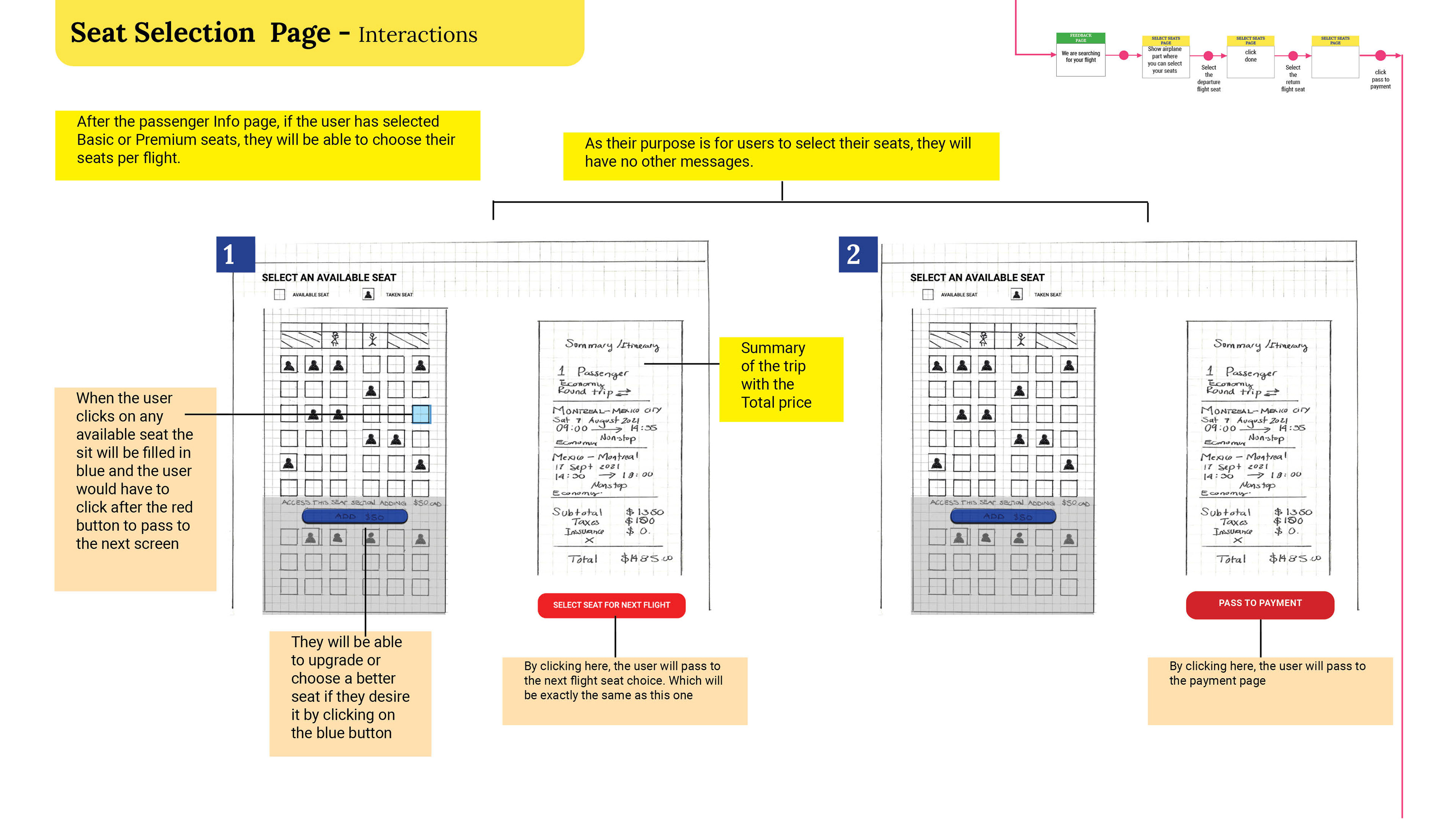
Now was the time to define the extra details that developers need to build the product accurately. To see the entire Wireframe, you can click here.
