The MANDATE & CONTEXT
Worximity is a SaaS company that helps manufacturing teams improve production performance through real-time data and analytics.
WX already had an analytics platform, but adoption was low. There was no visibility into product usage, and limited understanding of user sentiment. As a result, stakeholders aimed to redesign the platform to improve adoption.
My Role: As Product Designer, I led product analytics adoption, user research and behavior analysis, stakeholder interviews, insight synthesis, analytics UX/UI redesign, data visualization standards, Wireframes and Prototyping and had-off to the development team.
Research & Discovery
1. Start Collecting Usage Data
The company had no visibility into how the platform was used. So Qualitative and Quantitative Research were used to start finding the platform main problems.
Survey
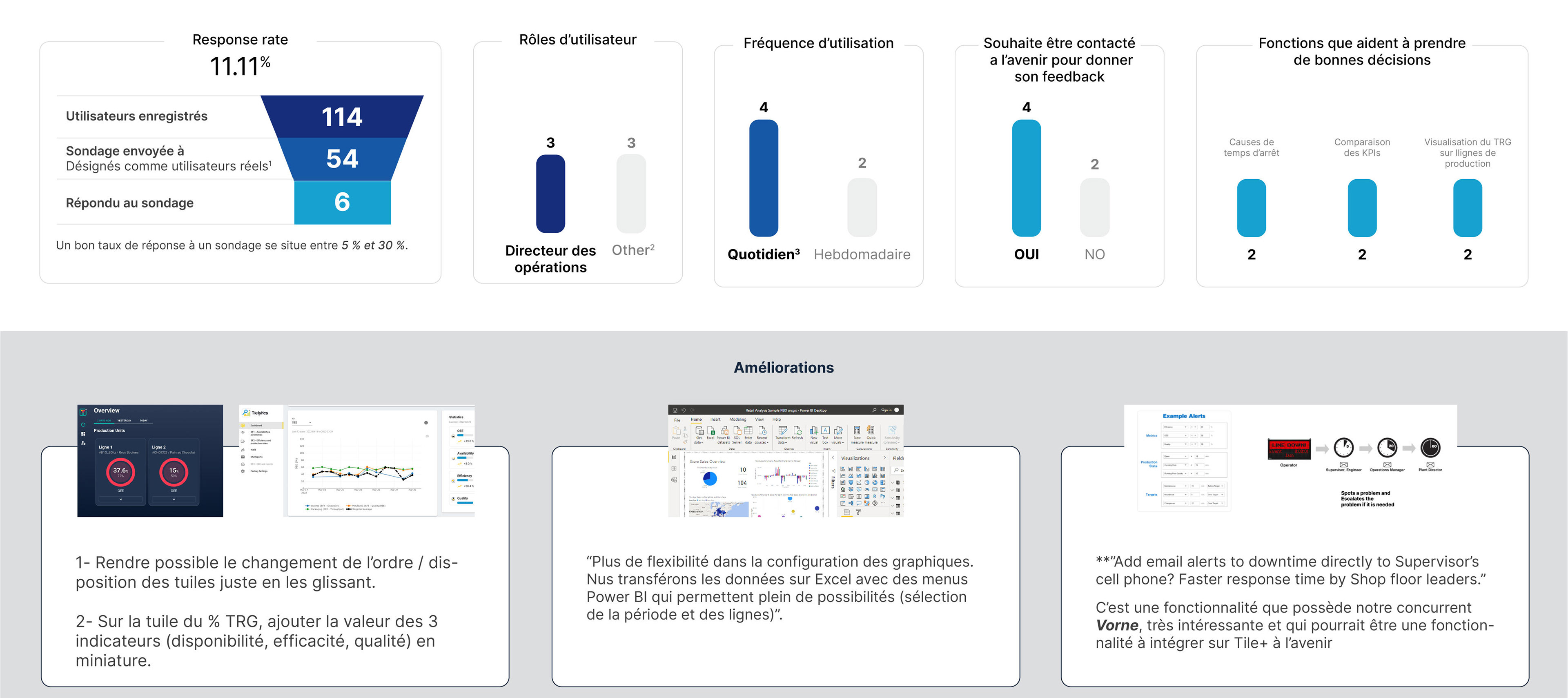
A concise 4-question multiple-choice survey was distributed to users via email to gather early product feedback and usability insights. At the time, the platform did not yet support in-app communication or integrated user analytics and survey tools.
USER INTERVIEWS

Through interviews with the users, several patterns emerged:
- Lack of Awareness: Some users didn’t even know the Analytics platform existed.
- Many users preferred to export data to, cross-reference with external sources, manipulate numbers manually, build their own comparisons
- Lack of Trust, Users reported differences in calculations in the realtime vs analytics platforms, creating uncertainty about calculation logic and confusion about what they were actually looking at
USABILITY AUDIT
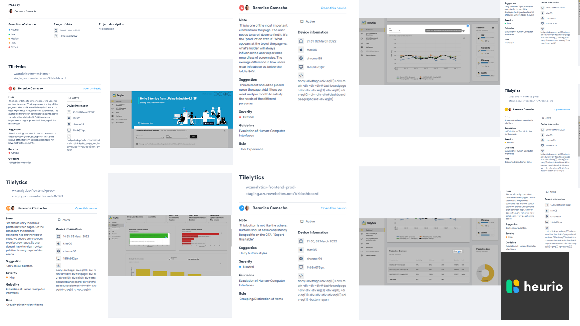
The first stop was to conduct a usability audit using Heurio to evaluate the existing product experience against UX best practices. Analyzed pages, workflows, and interface elements to identify usability issues and their root causes.
Using Heurio’s framework, issues were objectively mapped to specific UX principles and heuristics that were not being followed, helping prioritize actionable improvements.”
THE DISCOVERIES
ZERO AWARENESS OF THE PLATFORM.
Many of the users weren't aware of the existence of the analytics platform, they just consulted the Real-time platform.
NOT a WELL DEFINED USER PERSONA.
Before the Mandate it was blurry who should be using the Platform, the economic Buyer CFO, Finance, the Continuous Improvement team, the Director of Operations or the Supervisor. After the User Interviews we were able to create a Persona for the Software.
Without trust, analytics becomes noise.
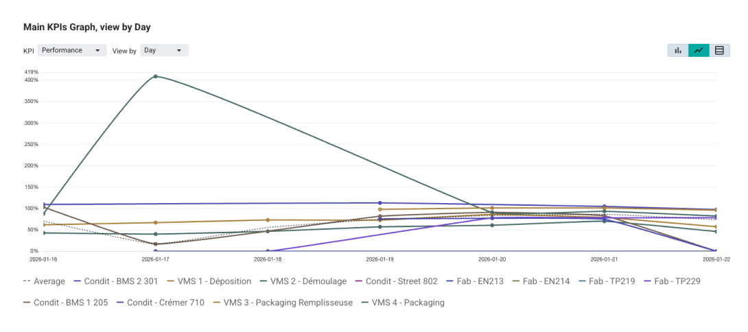
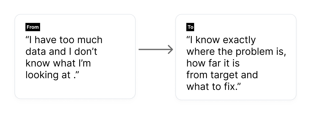
Meaningless Visualizations, line charts dominated the interface, but users didn’t need only trends — they needed prioritization. A line graph does not answer clearly which line is performing worst? How far is it from target? Is it underperforming compared to others?
Without clear visible targets and comparisons users cannot asses urgency
A line performing at 78% OEE may look “acceptable” — but if the target is 85%, it becomes a clear priority. Conversely, a lower number might be acceptable if aligned with realistic expectations.
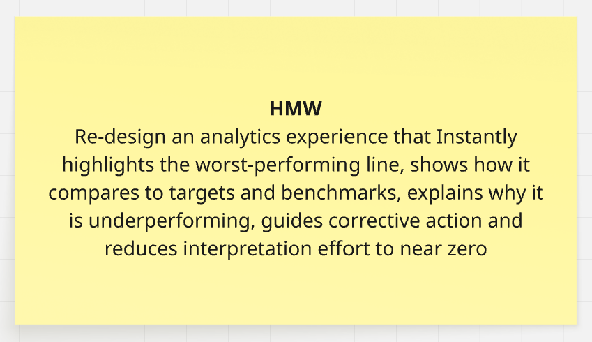
PROBLEM DEFINITION
After Analyzing the data and conduct a Lightning Decision Jam Workshops we were able to frame different problems and agree on what we should focus first to deliver an MVP.
THE SOLUTION
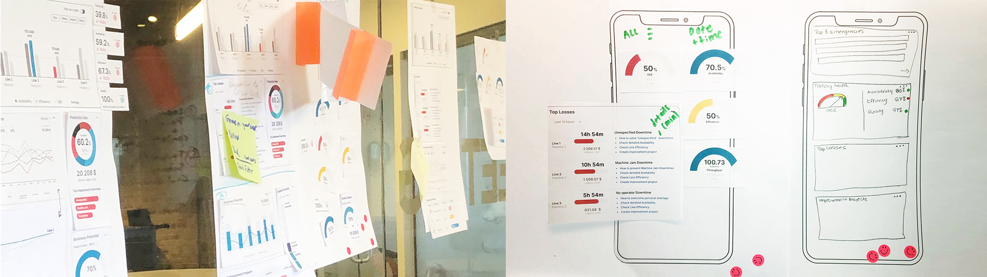
1. User Persona
Operations Director / Continuous Improvement Manager
A data-driven manufacturing leader focused on improving production efficiency, reducing downtime, and increasing line performance. Uses the Worximity Analytics platform to monitor KPIs, identify production losses, analyze trends across lines and shifts, and make faster operational decisions to drive continuous improvement.
A data-driven manufacturing leader focused on improving production efficiency, reducing downtime, and increasing line performance. Uses the Worximity Analytics platform to monitor KPIs, identify production losses, analyze trends across lines and shifts, and make faster operational decisions to drive continuous improvement.
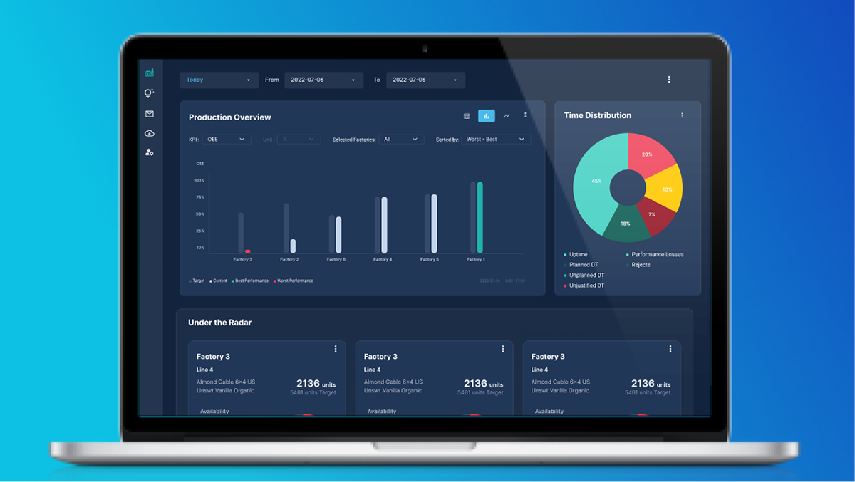
2. From Trends to Prioritization
We replaced most line graphs with ordered bar charts, designed to always sort from worst → best, clearly show deviation from target. Using consistent colour coding used in real-time monitoring was applied in Analytics to reinforce familiarity and reduce cognitive load.
Now, in one glance, users can see, which line is worst, how far it is from its target, how it compares to others, where immediate action is required. No interpretation required.
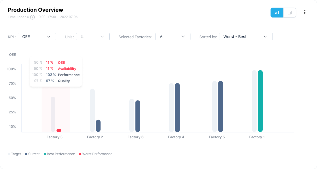
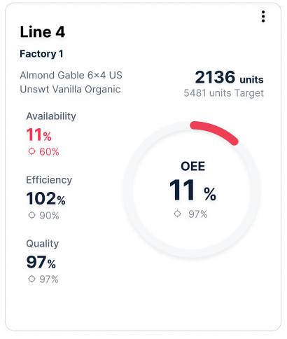
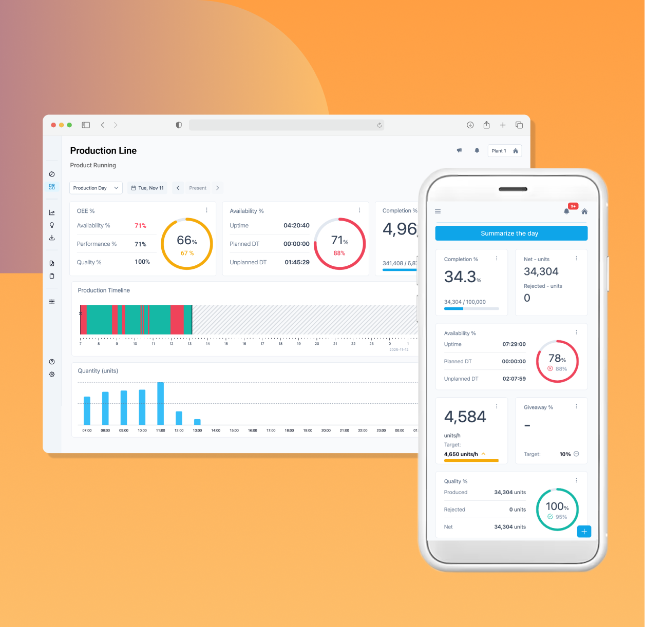
3. Main KPI - OEE Component Visibility
Instead of showing only aggregated OEE, users can now see at once, Availability, Performance and Quality. For each production line, alongside their respective targets. This allows them to immediately identify whether the issue is: Downtime (Availability), Speed (Performance) or Rejects (Quality). And whether each component is below benchmark.
4. Action-Oriented Clarity
Once the issue is identified, the user can clearly determine, Should we reduce downtime? Should we increase speed? Should we address quality issues?
Because every KPI is contextualized against its target, improvement opportunities become measurable and actionable.
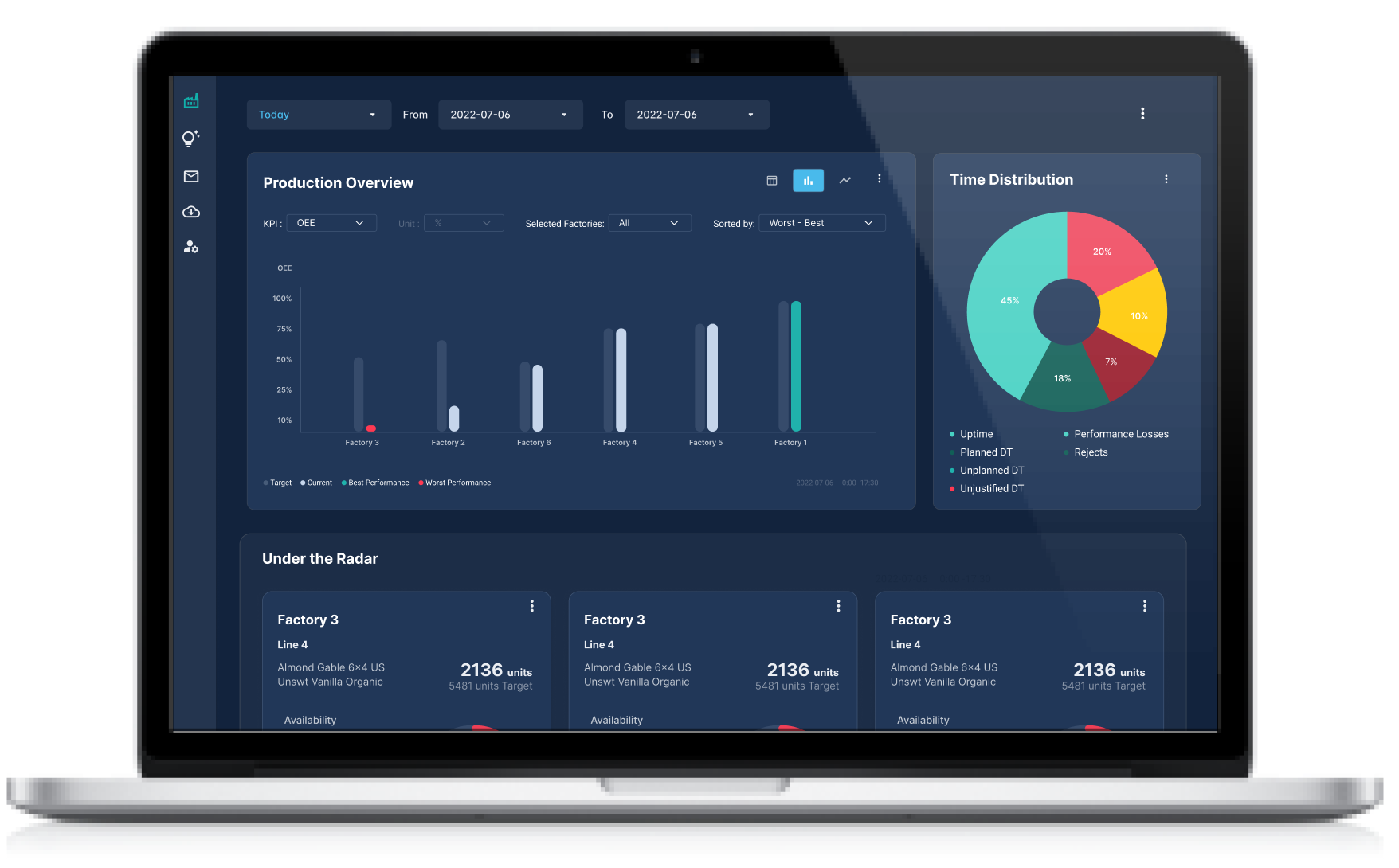
5. Configurable Dashboard
Recognizing that operational priorities vary, we introduced a configurable dashboard, users can choose which KPIs to display, adjust timeframes, compare against targets or historical benchmarks, filter by line, product, or shift. This balances standardization with flexibility while preserving clarity.
Impact
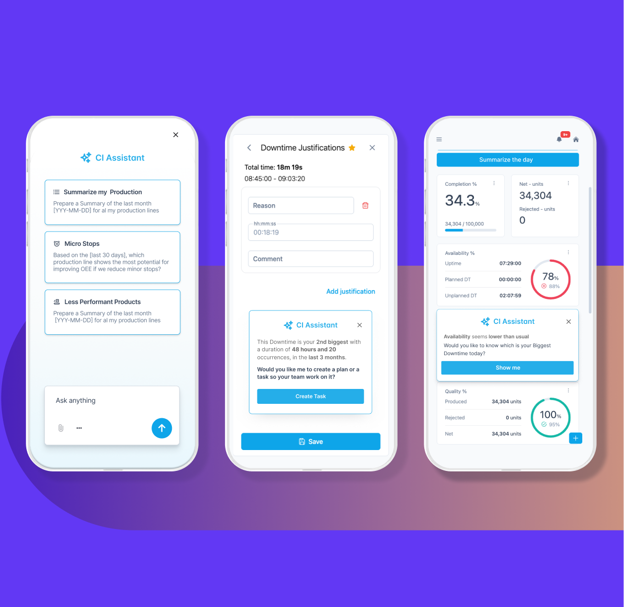
Increased visibility into platform usage via In-app campaign after redesign, Improved trust through consistent calculations and visual logic, Clear benchmark visibility across all KPIs.
The redesigned Analytics platform empowers Manufacturing Operations to move from:
Of course this was just the beginning of many Iterations that are still on going.
The redesign included the implementation of analytics software to monitor user engagement, alongside an awareness campaign and a review of calculations, tooltips, and supporting links to help users better understand the data and metrics.

MORE RELATED PROJECTS